
 orcid.org/0000-0002-2777-8707

I was inspired by this blog post from DAVID MCCANDLESS & STEFANIE POSAVEC reporting their winning design for Wired US in December 2010.
Their task was to redesign a typical medical report: blood tests. All over the World blood tests are returned to a patient in the following way;

Scores are referred to normality ranges and the report is written most of the time in away that is difficult to comprehend unless you are medical practitioner. Furthermore, abbreviations and acronyms are not explained and actions to change the results are not explained.
Then they designed a new report which looks like this:
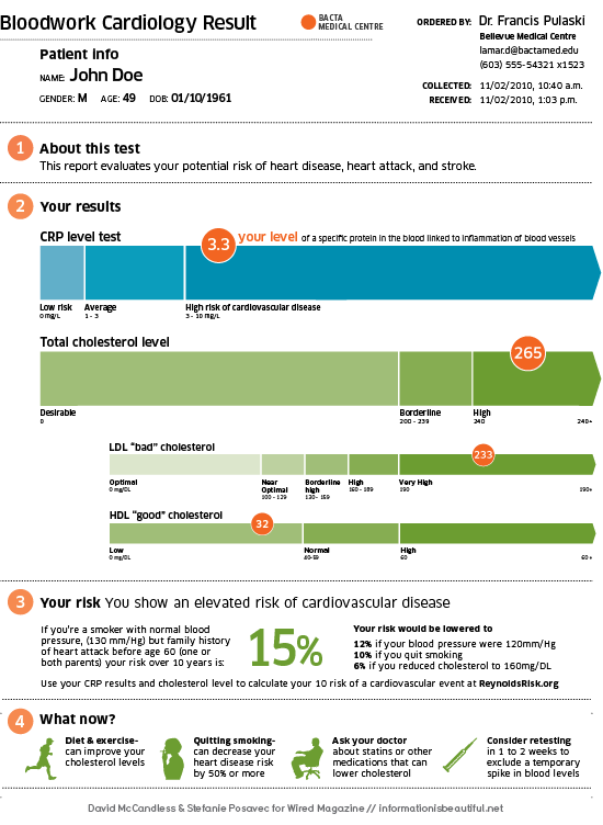
I would like to comment that not only they have done a great job in terms of design. They have done a wonderful job in terms of how they present the information.
Reports to athletes and coaches should also be like the one above. Simple, color-coded and user friendly as well as providing suggestions for action.


0 comments:
Post a Comment