Saturday, 12 July 2014
Tableau and Surveys
Friday, 1 July 2011
New visualisations of interesting data
I just came across the wonderful infographics of the Cure Together blog. Alexandra Carmichael and Daniel Reda launched CureTogether in July 2008 to help the people they knew and the millions they didn’t who live in daily chronic pain. Starting with 3 conditions, it quickly expanded as people wrote in to request that their conditions be added to this ongoing study. CureTogether is currently funded by its founders and angel investment, and has partnered with several universities and research organizations.
They provide some excellent infographics on common conditions. The graphic below shows the most effective treatments for chronic fatigue expressed by popularity and effectiveness. A really nice way to express findings. It should be said that the findings are generated by people filling in questionnaires online.

Below is the result of a questionnaire aimed at understanding the effectiveness of various common colds remedies. Here are the results:

TO generate the data above, at CureTogether, 139 people who have experienced the Common Cold have come together to share 1,079 data points about treatments they had tried and how well they worked or didn’t work.
Last but not least, David McCandless and his team have updated the snake oil infographic. And the results are of course very interesting, showing some more supplements with potential.

Friday, 27 May 2011
Curious tools: Google Correlate
Google Correlate is an experimental new tool on Google Labs which enables you to find queries with a similar pattern to a target data series. The target can either be a real-world trend that you provide (e.g., a data set of event counts over time) or a query that you enter. Google Correlate contains web search activity data from January 2003 to present. The data is updated weekly.
So this is pretty much a great tool to look at real World trends as it uses web search activity data to find queries with a similar pattern to a target data series. Some of the findings can be quite interesting.
Let’s look at this example searching for “losing weight”
The highest correlation coefficient is with the search “burn calories” and you can see not only the worrying trend of increase in such search trend, but also the seasonality of the search if you zoom into the graph.
And you can clearly see that between December and January is when new years’ resolutions kick in as well as the bikini sindrome in the summer months.
Now, let’s try something a bit more relevant to sport. Let’s try “doping”, as you can see, there are peaks of searches and the highest correlation coefficient is with “what is doping”.
with peaks in May 2010….when Landis admitted taking performance enhancing drugs and pointed the finger at Lance Armstrong.
The word “Testosterone” has the highest correlation coefficient with “Natural Levels”. And there seems to be a growing interest in such search word, I hope only because people are interested in the science….
The search for “Strength training” really worried me. A part from the highest correlation coefficient with “Exercise” what worries me is the decline in its use for web search. Does it mean we should expected a reduction of interest towards this form of exercise?
So, to double check I looked at the search word “Bodybuilding”…and I got really worried as the highest correlation was with “death index”….whatever that means
Really an interesting tool. You can look at it yourself on: http://correlate.googlelabs.com/.
Another tool is Google Trends. Even cooler, as it allows you to study search volumes and look at specific media-related events. Again, when searching for volumes of searches of the keyword “Doping” specific events where highlighted.
Brilliant stuff from Google Labs. Keep them coming!
Sunday, 1 May 2011
Cool graphics
With so many energy drinks out there containing caffeine it is a bit of a jungle to give advice to athletes and coaches and/or educate everyone about different options.
This Caffeine Poster was developed by Randy Krum and it is available on his great blog coolinfographics.

I think this is just another great example of how to present data in a meaningful way. Well done Randy!
Wednesday, 20 April 2011
More freeware biomechanical software
The two solutions are quite interesting and very good quality. The first software is called Skill Capture

SkillCapture is designed to capture video clips which can be directly associated with the athlete also by means of a radio frequency ID system (skillchip).
Video capture can be started by:
- Motion detection
- SkillChip registration
- SkillChip registration and Motion detection.
- Pressing keyboard shortcut
- Using wireless presenter
- Adjust playback speed (0.5 - 2.0 of normal speed)
- Rate performace
- Mark for upload
- Draw angle to show body positions
- Freehand drawing
The other solution is SkillSpector.

SkillSpector is a video based motion and skill analysis tool for Windows. SkillSpector is freeware and can be downloaded and installed on any computer.
SkillSpector features:
- Video overlay for direct video on video comparison
- 2D and 3D analysis
- Standard model definitions for fast analysis
- Semi-automatic digitizing using image processing techniques
- Easy advanced analysis of linear and angular kinematic data
- Calculation on inertia
- 3D representation of movement
- Simple video calibration
I have just installed the software and I will write something more about them after I get the chance to experiment with them a bit more.
Sunday, 6 March 2011
Visualizing blood tests
I was inspired by this blog post from DAVID MCCANDLESS & STEFANIE POSAVEC reporting their winning design for Wired US in December 2010.
Their task was to redesign a typical medical report: blood tests. All over the World blood tests are returned to a patient in the following way;

Scores are referred to normality ranges and the report is written most of the time in away that is difficult to comprehend unless you are medical practitioner. Furthermore, abbreviations and acronyms are not explained and actions to change the results are not explained.
Then they designed a new report which looks like this:

I would like to comment that not only they have done a great job in terms of design. They have done a wonderful job in terms of how they present the information.
Reports to athletes and coaches should also be like the one above. Simple, color-coded and user friendly as well as providing suggestions for action.
Saturday, 5 March 2011
Data visualization. Innovative techniques and interesting data
I have been fascinated by the enormous opportunities now available to improve the way we can present data. This is particularly important when we share data with coaches and athletes, but also when we present complex data sets for reporting purposes or when lecturing diverse audiences. Considering the fact that in sports science we are dealing with more ad more data, it is clearly now needed to improve how we process and present them to improve our understanding and trying to communicate clearly specific outcomes.
If you are curious. You should go and visit this interactive webpage.
It shows the evidence for supplements for various conditions. As you can see…few things seem to work. Data are taken and updated from PubMed and Cochrane.
Amazing isn’t it?
If you want to know more, you should read this book.
I had the time to play a bit with Google Ngram viewer.
This google tool allows you to interrogate the occurrence of keywords in a large database of books.
Here is the result for strength training, athletics training and exercise physiology in English.
Wednesday, 22 December 2010
Monitoring training load: the sum of all parts
Finally a little bit of spare time to do some blog writing. I have discussed the issues of monitoring training loads in my previous posts #1,#2,#3.
Also, I have written a previous post on strength and power assessment and vertical jumping tests.
So, I am not going to discuss testing techniques here, but rather discuss what monitoring is all about and how to use it and offer some solutions/ideas.
Monitoring is definitively a sexy topic as everyone seems to be “monitoring” something in training. To the extent that some athletes are also now flooded with questionnaires, spreadsheets, forms to fill in. Most of such information I have to say it is totally useless as it does not get used and/or is totally irrelevant for designing better training programmes.
Why testing and monitoring training then? First principles first:
Testing and monitoring are useful tools only if they allow you to analyse the athlete’s level and be able to define and adapt a training programme.
If you are measuring something that does not help you in modifying the training plan you are wasting your time!
Also, you should make sure you measure things using methods that are valid and reliable! For more information about validity and reliability I suggest you read Will Hopkins’ excellent blog here. If you use measurement tools and modalities that are not valid and reliable you are wasting your time!
Testing and monitoring are tools to help you in making better decisions with your training planning. They are not standalone activities and you should question everyone of them in terms of cost effectiveness not only in financial terms but also in terms of athletes’ time. I have seen in too many sports athletes filling too many questionnaires and forms that are neither valid nor reliable nor provide any meaningful info to the coaching staff.
Planning training is just like business. Testing and monitoring will tell you where you are now. Strategic planning, analysis of specific performance trends (or world trends) and goal setting will help you in defining where you need/want to be. The how you get there is your training plan. If testing does not help you in getting a better HOW, it is just a useless data collection exercise.
Most of all, a proper approach to testing and monitoring can make sure you avoid insanity and learn what works and what does not work with you athletes.
So, what should be the approach?
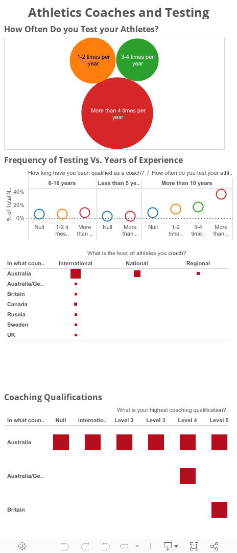
In my view it is relatively simple. You need to be able to collate all the information you decided to collect, analyse it, make some sense of it and build a “dashboard” to visualise what is going on in order to be able to intervene where necessary. One of the approaches I suggested previously involves the use of radar charts to profile each individual athlete in comparisons to team scores. Similar approaches can be used even with individual athletes just comparing the magnitude of changes in their own scores:
However, a more comprehensive view could be obtained using what I call a “performance equaliser”. The example below shows how some specific scores ca be plotted with an equaliser dashboard and visually show how specific parameters can change during a training season.
Performance Equaliser #1: Beginning of training phase
Performance Equaliser #2: After few weeks
This approach can be used to evaluate each athlete’s situation and take appropriate action as well as providing an easy to understand reporting structure. I have used green and red to express good change and not so good change.
Good, continuous data can also help in having a more complex data analysis approach involving the possibility of data modelling and simulation to be able to predict some outcomes. The example below from Busso et al. (2007, JAP) is just an example of the scientific literature on modelling.
This is one of the areas I am working on as I have a keen interest in computational statistical models applied to training and performance data and I have to say that there is very limited information on this topic and the few experiments also have very limited samples sizes (I found a couple of paper with n=1!). A review of the literature is now planned and I hope it will be ready for 2011 thanks to the hard work of an excellent PhD student working on this topic in my lab.
Many companies are now offering all sorts of software to analyse data using typical modelling approaches such us decision trees, Monte Carlo methods, etc. However it is important to state that the quality of the analysis is as good as the data you collect. So, again, you get what you put in it. Also, if your data are wrong, you will definitively make the wrong calls!
Despite the fact that simulations and data modelling have a certain degree of error (from very very large to relatively small), I still believe that this is something to pursue as I believe that nowadays some good continuous basic data can be collected and they can provide some useful information. As Richard Dawkins stated in his book “The Selfish Gene” “[…] of course there are good models of the World an bad ones, and even the good ones are only approximations. No amount of simulation can predict exactly what will happen in reality, but a good simulation is enormously preferable to blind trial and error!” R. Dawkins (2006).
Another useful approach can be the use of simple mathematical/financial laws as the Law of Diminishing Returns. The law of diminishing returns states that as the quantities of an input increase, the resulting rate of output increase eventually decreases.
This is exactly what we see in training. We increase and decrease training volume and intensity and we see changes in performance (output) which increase or decrease if we do too much work.
Recent work from my colleague Dr. Brent Alvar’s lab have shown how such approach can be used to analyse for example the effectiveness of strength training following a meta-analytical approach (for more info, click on the graph below).
Despite the fact that others criticised this approach for analysing the effectiveness of multiple vs. single sets using literature data, I believe that such approach can and should be used to understand the effectiveness of a training programme (or the return for your investment in time and effort). This should help in understanding the dose-response relationship to training loads in your athletes.
I am sure I have not covered a lot of aspects, and I am sure I will change my mind about a few of the things I wrote in the future (this is what learning is all about!). But at the moment I feel that monitoring training is a very useful thing to do and some statistical approaches can be applied to extract useful information to translate analysis into actions.
So, to summarise, here is some advice:
- Are your tests valid and reliable?
- What is the error of measurement? (What is the noise of your data?)
- What are you measuring?
- Are you able to use the data you gather to action changes to the programme?
- What is the investment in time/costs/effort to collect the data? Is it worthwhile?
_ How long does it take to receive the data in order to analyse them? (e.g. blood tests tend to be analysed few days after you collected them)
- Can you collect some valid, reliable, non subjective data with high frequency?
- Are the data good enough and frequent enough to allow you to make some predictions?
Sunday, 26 July 2009
Free software for notational/video analysis
I have recently downloaded the most recent version of LongoMatch, a free software capable of performing video analysis and tagging with loads of functions. This is another great tool, completely free and very useful for coaches, sports scientists and performance analysis.
This is a brilliant software, easy to use and user friendly. I spent about 20 minutes to figure everything out and was able to complete quickly some analysis of Handball games.
With LongoMatch you can tag the most important plays of the game and group them by categories to study each detail of the game strategy. Once you tagged a play, you can review it with a simple click, even in slow motion, and adjust the lead and lag time of each play frame by frame using the timeline. LongoMatch has support for playlists, an easy way to create presentations with plays from different games. If you prefer, you can even export the playlist to a new video.
The Manual is available here.
If you are a coach and/or a sports scientist willing to perform tagging of specific activities performed by your athletes, you definitively need to try LongoMatch a great free software!
Saturday, 8 December 2007
Testing team sports athletes and analysing data
Many strength and conditioning coaches and/or exercise physiologists are nowadays employed to work with team sports. Testing and monitoring training is now becoming standard practice and data analysis, data mining and the ability to produce meaningful reports is a necessary skill of the elite sports science support staff. I this short post I will not discuss the main aspects to consider when performing a test and/or the limitations of testing procedures. I will just present simple examples of reporting data using Microsoft Excel.
When dealing with large squads, single athlete's scores should be analysed and continuously monitored to make sure the athlete is progressing and improving. However, in order to profile areas of improvement it is important to compare the single athlete to the group or to a known group of elite performers.
A very simple way for doing this with excel is to collect all the data in a single sheet with the name of the athlete in the first column and all the tests scores in the following columns. Then, when the average values and the standard deviation for the team is calculated, all scores of each individual player can be transformed in Z-Scores. In Excel this is possible using the function STANDARDIZE which returns a normalised value from a distribution characterised by mean and standard deviation.
The syntax is the following:
STANDARDIZE(x,mean,standard_dev)
X is the value you want to normalize.
Mean is the arithmetic mean of the distribution.
Standard_dev is the standard deviation of the distribution.
Once each score is normalised, spider charts can be used to see how each individual player scores as compared to the team scores. Two examples are given here. Zero is the team score, every score higher than zero means that the athlete scored better than the average value, every score below zero means that the athlete scored less than the average value.
Figure 1: This is an athlete that outscores the team average values in all tests
Figure 2. This is an athlete outscored team results only in sprinting.
When we plot the results in this way we can clearly identify areas where we need to make an impact with a training programme. So, while in athlete JL we need to put a lot of emphasis on sprinting abilities, on athlete H we need to do a lot of work on strength and power. With this approach we can then track not only athlete's development in different areas but also how they evolve in comparison to his/her team scores. Individualization of training is the key aspect to take into consideration when working in team sports. Data analysis allows the coach, the physiologist and the sports scientist to profile each individual player and provide appropriate training interventions.
Popular Posts
-
How many times have your heard the following: "your gluts are not firing"? I bet many times. In the World of Strength and Conditio...
-
I decided to write this post after having seen numerous tests reports in which the results of squat jumps appear equal and sometimes higher...
-
The new buzzword in the sporting domain seems to be "Functional". Everything these days is has this F word attached to it. I ha...
orcid.org/0000-0002-2777-8707

