Wednesday 30 March 2011

Want to know more about Near Infrared Spectroscopy?

If you are curious about Near Infrared Spectroscopy (NIRS) and happen to be in Edinburgh in the next few weeks make sure you visit the science festival.

The primary application of NIRS to the human body uses the fact that the transmission and absorption of NIR light in human body tissues contains information about hemoglobin concentration changes. When a specific area of the brain or a muscle is activated, the localized blood volume in that area changes quickly. Optical imaging can measure the location and activity of specific regions of the brain or muscles by continuously monitoring blood hemoglobin levels through the determination of optical absorption coefficients.

My PhD student Catherine Hesford has just started a blog here. Catherine will conduct an experiment with members of the public and will explain the theory behind NIRS together with my colleague Professor Chris Cooper.

The Science Festival in Edinburgh starts on the 9th of April, all details are available here.

Tuesday 8 March 2011

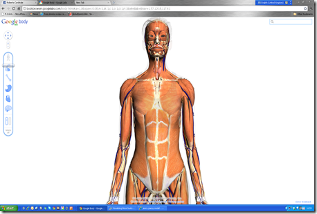
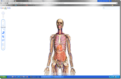
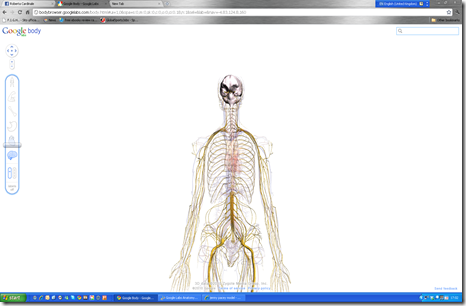
Google Labs Anatomy

image

Have look at this. Google Labs has developed an interactive application to browse the human body layer by layer.

image

image

Another freeware tool to review anatomy!

Sunday 6 March 2011

Visualizing blood tests

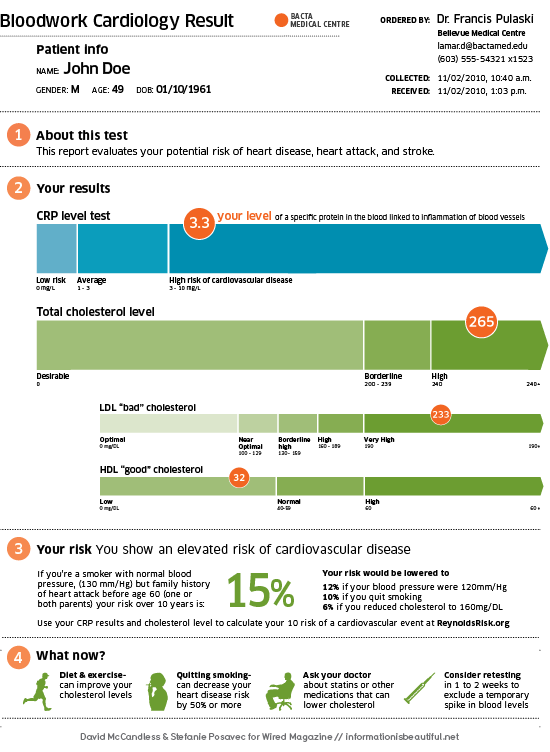
I was inspired by this blog post from DAVID MCCANDLESS & STEFANIE POSAVEC reporting their winning design for Wired US in December 2010.

Their task was to redesign a typical medical report: blood tests. All over the World blood tests are returned to a patient in the following way;

Scores are referred to normality ranges and the report is written most of the time in away that is difficult to comprehend unless you are  medical practitioner. Furthermore, abbreviations and acronyms are not explained and actions to change the results are not explained.

Then they designed a new report which looks like this:

I would like to comment that not only they have done a great job in terms of design. They have done a wonderful job in terms of how they present the information.

Reports to athletes and coaches should also be like the one above. Simple, color-coded and user friendly as well as providing suggestions for action.

Saturday 5 March 2011

Data visualization. Innovative techniques and interesting data

I have been recently reading a lot about data visualization. However, after having seen this TED talk by David McCandless:

I have been fascinated by the enormous opportunities now available to improve the way we can present data. This is particularly important when we share data with coaches and athletes, but also when we present complex data sets for reporting purposes or when lecturing diverse audiences. Considering the fact that in sports science we are dealing with more ad more data, it is clearly now needed to improve how we process and present them to improve our understanding and trying to communicate clearly specific outcomes.
If you are curious. You should go and visit this interactive webpage.
Snake oil? Scientific evidence for health supplements
It shows the evidence for supplements for various conditions. As you can see…few things seem to work. Data are taken and updated from PubMed and Cochrane.
Amazing isn’t it?
If you want to know more, you should read this book.

I had the time to play a bit with Google Ngram viewer.
This google tool allows you to interrogate the occurrence of keywords in a large database of books.
Here is the result for strength training, athletics training and exercise physiology in English.

Wednesday 2 March 2011

Current issues in Sports Nutrition

A great, free, online resource on current issues in sports nutrition has just been published by the Annals of nutrition and metabolism.

This special issue has been edited by Professor Asker Jeukendrup and contains comprehensive reviews of specific aspects of sports nutrition.

The special issue is available here.

Great authors, great chapters and excellent content. Well done Asker!


Popular Posts


Followers